
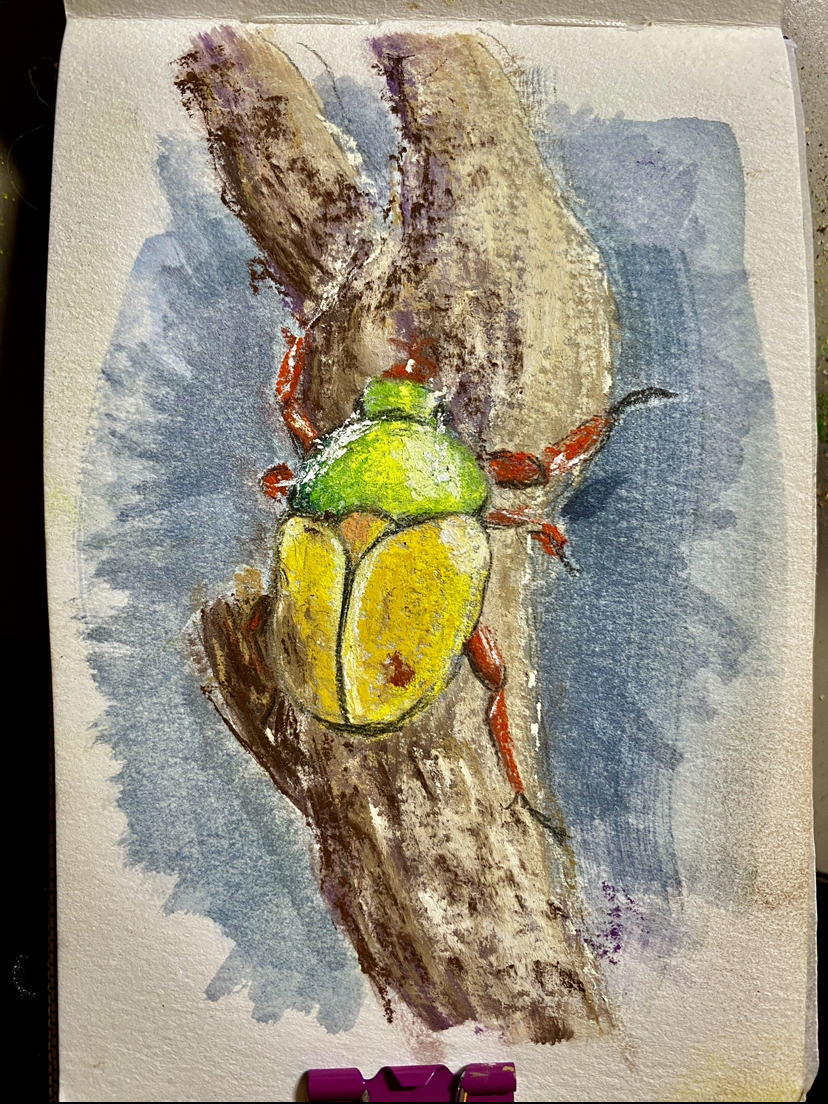
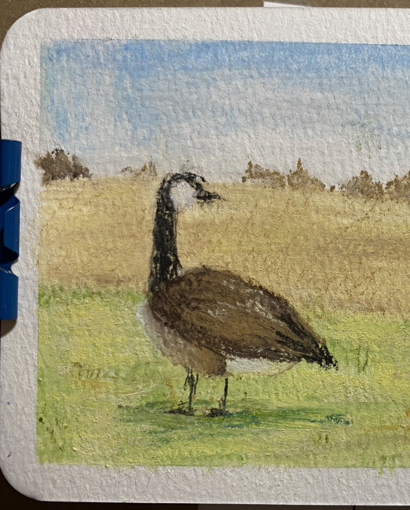
Pastel update: I did end up buying a larger set of them with a wider variety of colors & hues, so I've been playing around with those for the last week or so! The first is of a flower chafer we saw at Audubon Insectarium in New Orleans, and the second is... well, it was originally going to be a field of geese, but I chickened out so I guess it's now just one goose contemplating life...
I'm still just so captivated by pastels -- besides experimenting with them, I've been lurking on WetCanvas (the beginner thread is very helpful!), reading Landscape Painting in Pastel by Elizabeth Mowry, scrolling through Instagram (mostly because looking up "soft pastel" on Tumblr brings up everything under the sun except actual pastel paintings)... *trails off and starts daydreaming about things I want to paint* <3
Besides that, I'm not really sure what else to say... I've sold more things on Etsy in the last month than the last year, and I've spent most of today making more stock. I've also been doing little graphic design freelancey-things, making book covers & advertising banners. I didn't actually get around to going to the musical-thing I mentioned in the last entry, unfortunately. Also, I watched Society of the Snow (2024) recently, about the Uruguayan football team barely surviving a plane crash in the Andes, and it was really touching. The actual plane crash scene in the beginning was the most horrific thing I think I've ever seen -- just such a visceral, forced realization of how fragile the human body is, life as we know it...
Happy New Year!
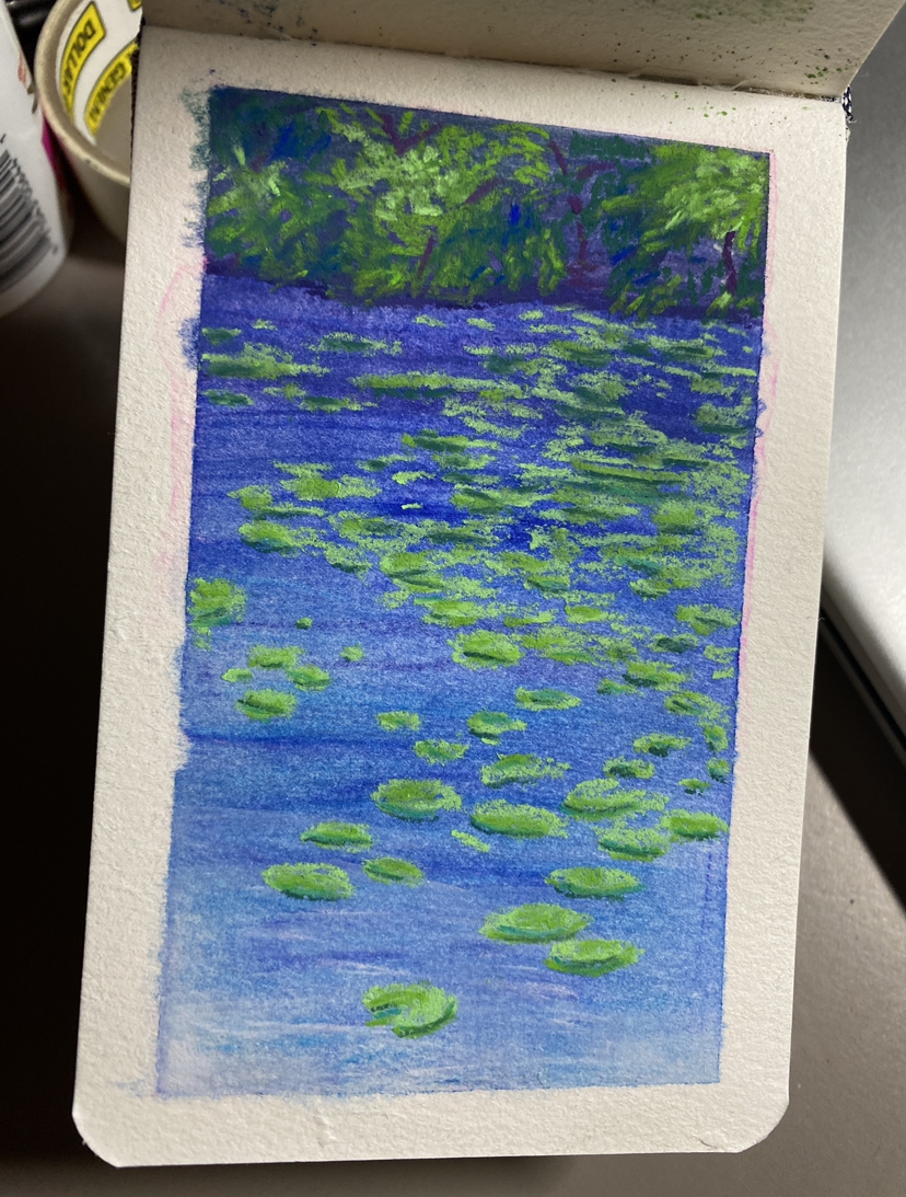
Here's the promised little update on the soft pastels: I'm really enjoying playing around with them so far! The first one below is based off a photo taken on the train to New Orleans, near Greenwood, MS. We stopped for about an hour right next to some waterlilies! <3 The second one is loosely based off a picture from a travel book about the Alps.
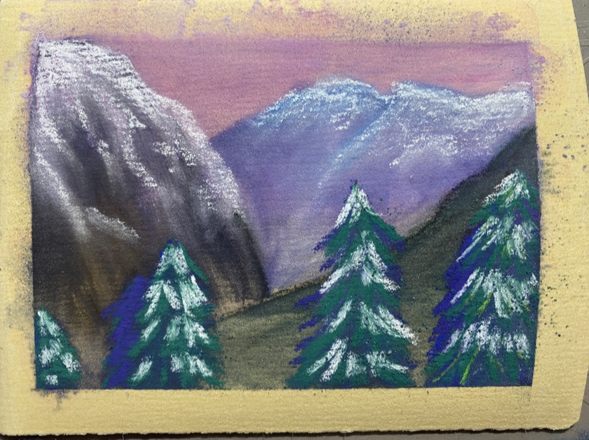
The way they layer is a fun difference compared to watercolor, and you can blend them with isopropyl alcohol to get an effect vaguely similar to a watercolor wash but textured and opaque. One thing I'm finding, though, is that this 24 color set I got is very limiting -- often I'll look at a reference photo and be specifically inspired by the colors... but, if you're straight up drawing with one of the sticks, you're unable to blend the colors. Which creates a horrible clashing disaster like the trees in the second pic above, rip. So, I've been looking into some of the little themed packs you can get from various companies to suppliment what I've already got... I just love my dull earthy colors so much I don't think I can bear to be without them.
Also, I've had this strange issue where when I do an alcohol wash, it leaves a giant pink stain?
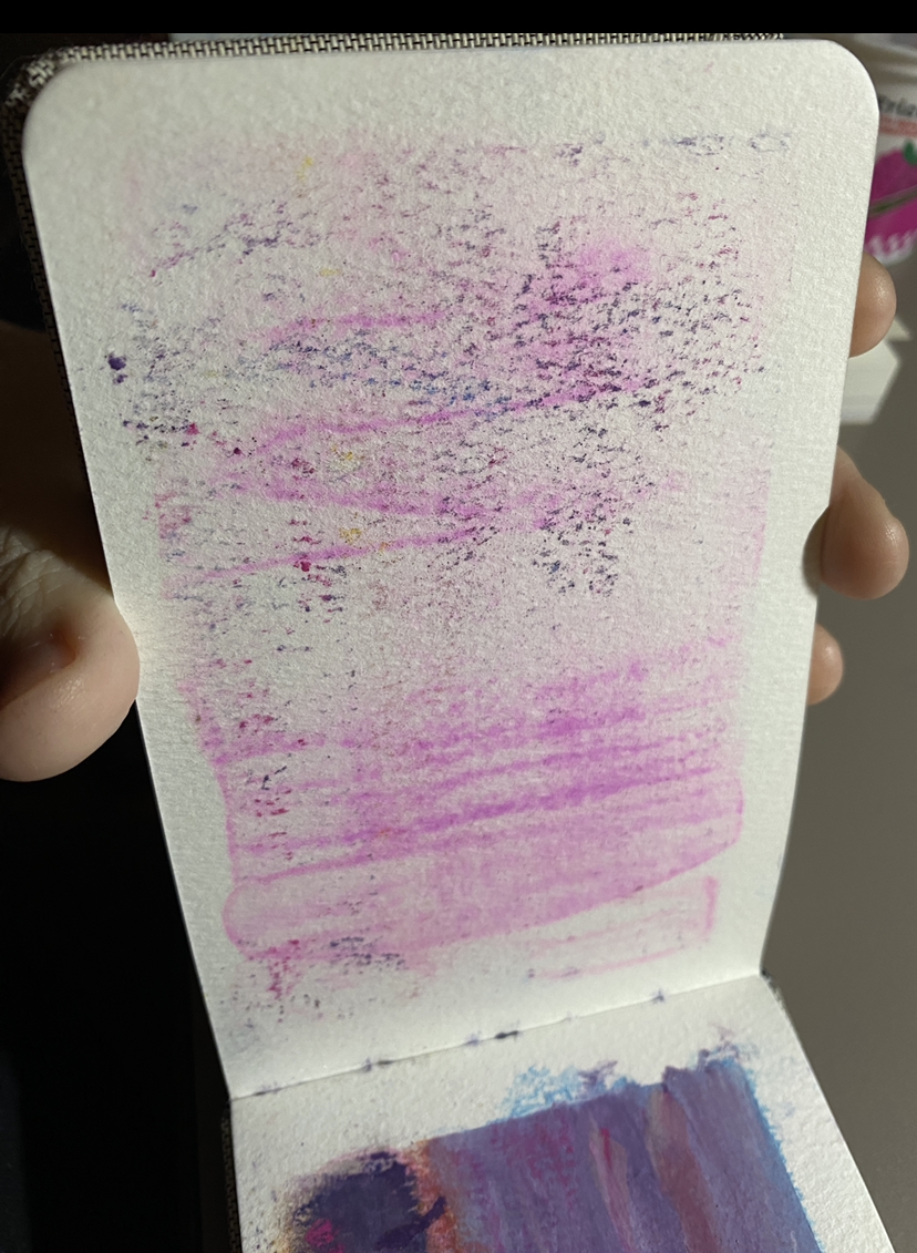
The weirder thing is, I've had the same issue when using gouache, as well, where my palette is stained the same strange neon pink color, despite not even using that color or anything. Different papers, different mediums, different solvents... Is it coming from the brush then?? I think that's the only thing that's being kept them same here? No idea...
On a similarly artsy note: I might've mentioned this before, but I'm planning on applying to be a set painter / designer for the upcoming season with that local musical troupe. Signups are this weekend!
note:I really love this art (at the top of the page); it's from the Neo Discovery set and the full image was apparently only available on a few little promotional items from the early 2000's, but was rereleased recently.
I made this edit just to test out Photoshop, but I think it turned out cool and grungy.